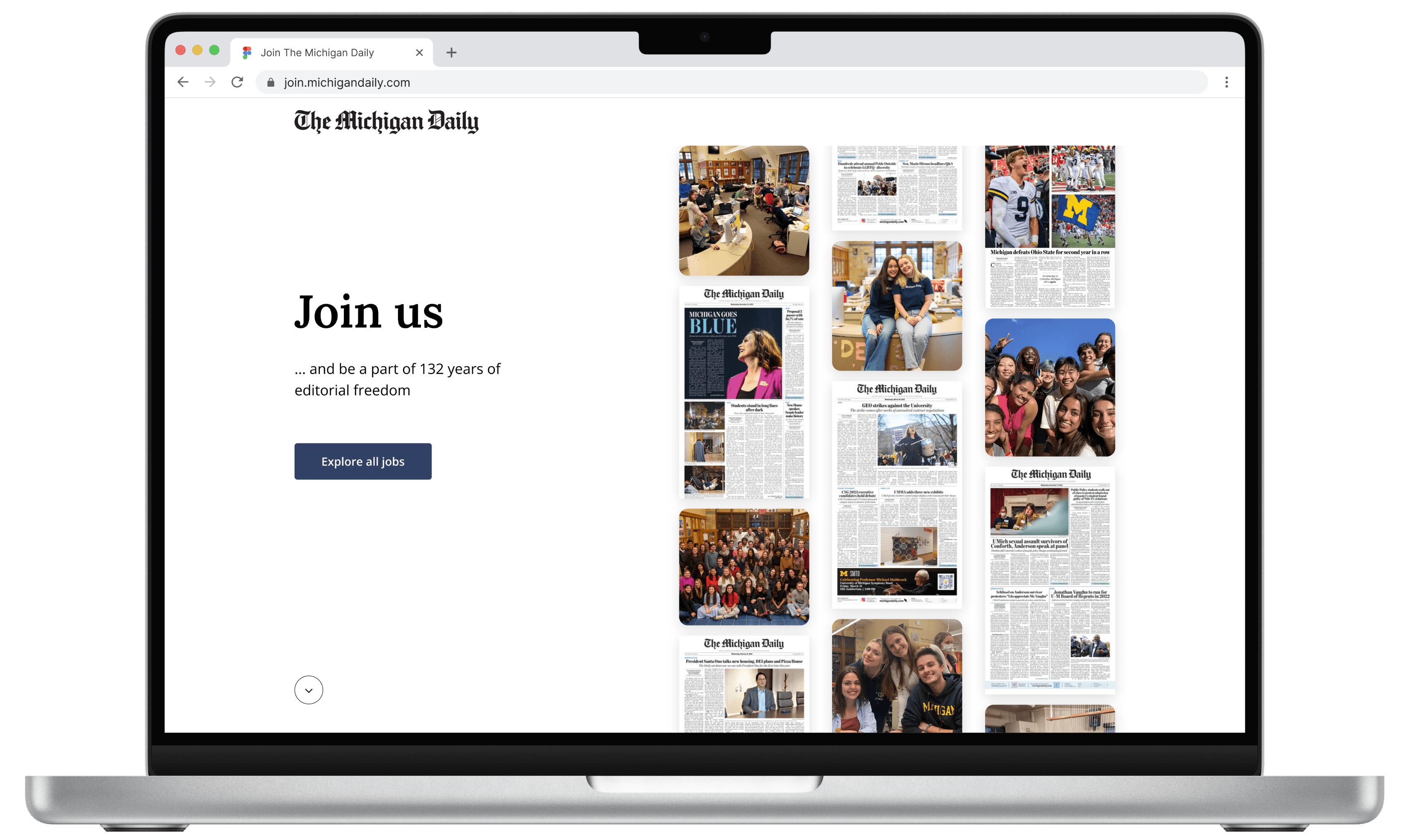
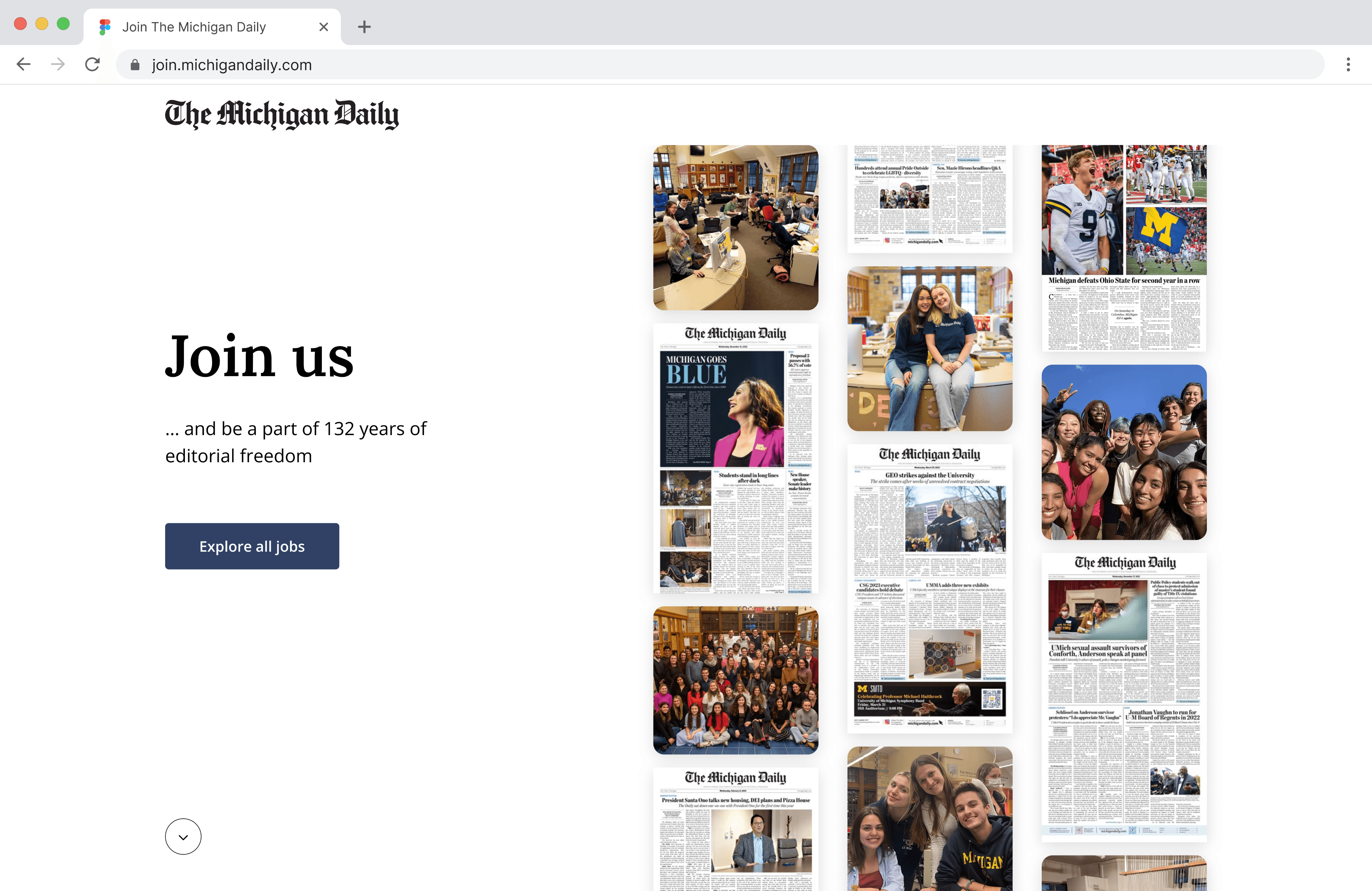
The Michigan Daily is the largest student-run, independent news organization at the University of Michigan. With over 132 years of history and 28,000+ followers on Instagram, TMD updates many on current events, represent students’ voices, and fosters a sense of community within Ann Arbor. TMD offers news across a variety of media, such as newspapers, podcasts, social media platforms, websites, and mobile apps.
In the Web Team, we've worked to redesign the "Join Us" recruitment page, the site that all applicants visit to submit their application to be a part of TMD.
Project type
Side project
Timeline
Summer - Fall 2023
Team
Web Team
My role
Lead product designer
An inaccurate representation of The Michigan Daily’s workplace
The Michigan Daily is home to many close-knit, inclusive communities with talented individuals. However, this has not been communicated accurately to external applicants, as new staffers often report being surprised at TMD’s environment. As a result, our leadership team has speculated the outdated recruitment site to cause a couple problems over the past couple semesters:
📉 Decrease in the number of applicants
A lower applicant pool may mean a less motivated workforce, leading to a decrease in quality.
🔀 More staffers requesting to switch teams
While staffers tend to switch into new teams instead of quitting outright, this still requires more resources to train and onboard them into the team. It can also decrease quality while the staffer is adjusting at first.
A smoother, more intuitive application experience
Uncovering additional problems through an in-depth analysis of the current site
When the leadership team informed us about the incongruence in our organization’s portrayal, the product designers decided to conduct a thorough UX audit to understand the problem more holistically.

After analyzing and synthesizing our sticky notes, we grouped our insights into 3 main categories:
Poor representation
Alongside the outdated job descriptions and inaccurate content, the website also didn’t embody the diverse and inclusive communities that make our organization so unique.
Poor navigation
With so many positions available within the application, navigating between pages to explore different options became tedious.
Poor use of space
The pages were often text-heavy with a lack of hierarchy. They also repeated information in multiple locations, making things cluttered.
The tale of 2 user groups
We interviewed 8 current staffers to understand their motivation and experience while they were applying to the organization. After analyzing their responses, we created personas based on the 2 types of users on each ends of the spectrum:

Kat, The Daily enthusiast
Kat is a junior studying film. She’s a big fan of TMD’s impact on campus and wants to get involved. While she’s not quite sure what skills she would offer, she’s interested in many teams on the website and is excited to contribute in any way possible.
“I don’t know what I can offer, but I want to make a positive change.”
Tim, the ambitious go-getter
Tim is a sophomore studying computer science. He knows that he wants to be a SWE after graduation. While he doesn’t know much about TMD, he heard great things about the opportunities in the Web Team and is curious to see if he’s a good fit.
“I know what I can offer and want to find specific opportunities that’ll help me grow.”
Pinpointing different user pain points for different personas at different stages
After understanding the main user archetypes, we created a user journey map of both Kat and Tim to understand the process that they would take on the current site to submit an application. Because their goals and motivation differed, they also had different pain points at different stages of the application.


After understanding the problems, our team transitioned into ideating solutions. In addition to the broader HMW statement of encouraging applicants of all backgrounds/experience levels to apply, we also set a few more specific goals to address pain points from different parts of the user journeys:
Highlight our work, culture, and impact to help users understand TMD’s work environment
Design more intuitive, efficient interactions to help users find roles that interest them
Help users quickly and clearly understand their expectations for individual positions
Prioritizing solutions that are both impactful & feasible to meet project deadlines
Our team brainstormed potential solutions for the 3 goals we set. Then, we placed each idea on a prioritization matrix to view its impact relative to its effort level and iterated on the few that were placed on the top right corner. The 3 colors of sticky notes each represent a solution to the 3 different goals we came up with.

Based on our ideas, we decided to add a home/landing page before the existing pages to reinforce the value of joining TMD. At a glance, here are a few main ideas that we chose to implement for each page:
🏠 Home page
A section about our values
Staffer interviews
Alumni spotlight
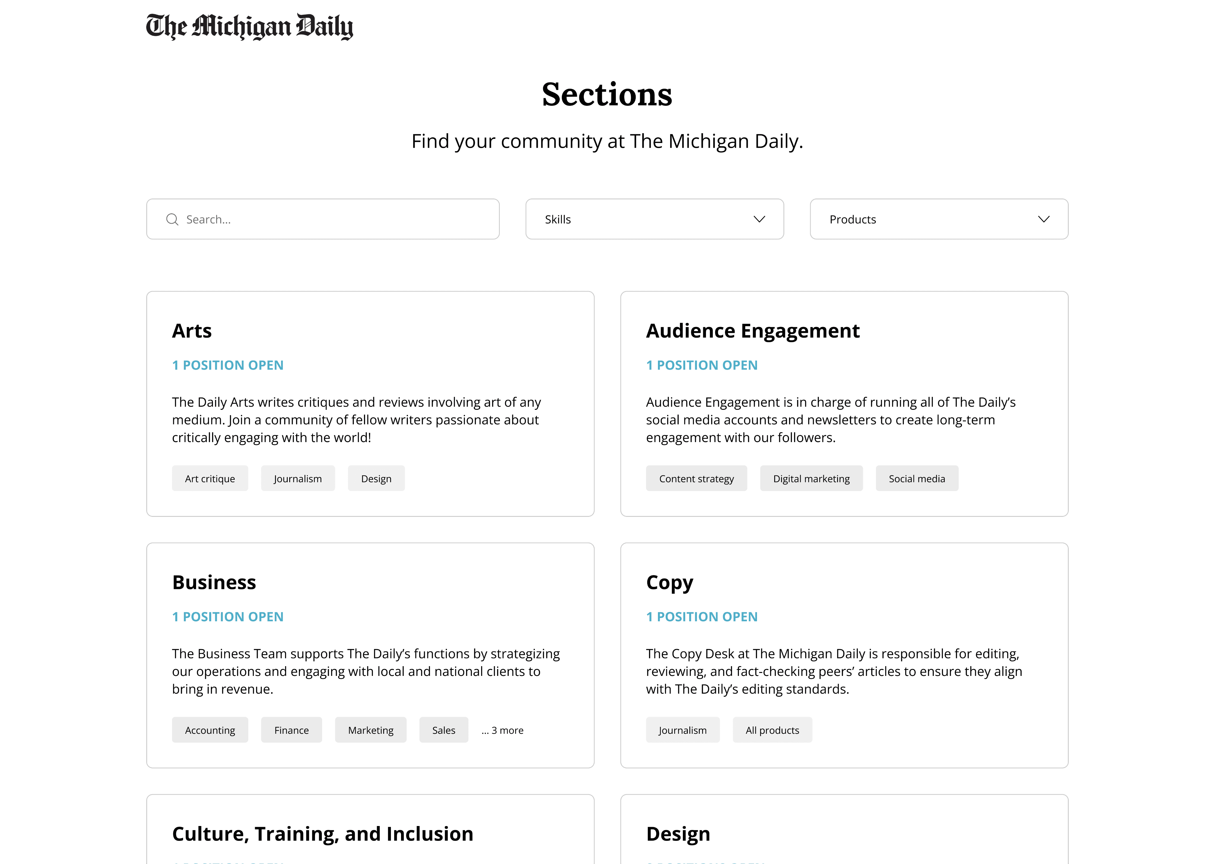
🗂️ Sections overview page
Search & filtering feature
Better descriptions of sections
📄 Section & position pages
Split screen navigation
Top banner to highlight important info
Featured projects section
Clearer hierarchy & less clutter
Marketing the organization’s rich, inclusive culture
As mentioned before, we added a landing page to showcase our culture and set expectations from the beginning of the flow, especially for users that don’t know much about TMD. On this page, we focused heavily on our commitment to DEI, one of our core values at The Daily. Here’s how we expressed this:
📸 Lots of photos
We believe in being “people first, staffers second.” Therefore, we put photos of smiling faces to present an unfiltered view into our community. Upon feedback, it also made TMD feel less “corporate”.
🎨 Rebranded UI
To match the overall tone and branding of our workplace, we made a new style guide with some pastel colors and rounded shapes.
💬 Friendly content messaging
To motivate prospective staffers to continue into the application flow, we used a very friendly and uplifting tone throughout the page to get them excited about working at TMD.
Based on these principles, we iterated on wireframes and got feedback through trial and error, resulting in the final prototype. The screens below show some of the thought process and iterations that went into making the final screens (none of which made it to the final prototype):


Multiple iterations and tests to optimize the navigation experience
We took an even more iterative approach to designing the rest of the flow. While we originally assigned everyone to design either the filtering page or the section/position pages, we eventually just worked together on all screens to understand how our choices for one screen would impact the other.
Industry analysis
First, to see how we should execute and express the ideas that we jotted down on the prioritization matrix, we turned to job sites and recruitment pages of top companies across different industries to get inspiration and understand the standards. Because every company and their applicants had different goals and priorities, we saw different features and implemented the ones that best aligned with our users.


After understanding a few ways to execute our ideas, we designed lots of wireframes for each of our screens to get feedback from testing.

Understanding user preferences
After we designed some wireframes, we went through multiple rounds of A/B testing with staffers at TMD and friends to help guide our design decisions. Here were some of things that we tested:


Design handoff and tracking metrics
We finished designing the website during the Fall semester, and our developers in the Web Team are currently building out the website. To ensure that our designs are developed properly, we're continuously checking in and communicating with them every week. The website is expected to go live in the Fall semester next year, and we'll track metrics then to continuously improve its experience.
My learnings from this experience
Overall, this project helped me keep in mind once again that you are not the user - if we had designed using our assumptions and biases, we would have gotten completely different results. It also emphasized the value of having a diverse group of designers which allowed us to empathize in different ways and help each other stay accountable for some of the biases that we had as individuals. Personally, it's allowed me to practice listening to others for insights while communicating my perspective as well.
Rose 🌹
Developing better empathy in a group setting
Designing for multiple user archetypes challenged my empathy skills and bias
Working with various teammates helped me understand multiple users’ perspectives
Thorn 🌵
Timeline complications
Our team took a break during the Summer & lost some progress
Old team members left and new team members joined in the new Fall semester
Bud 🌱
Building out this project
Excited to see the changes being made in the upcoming semester!
Thank you for reading! 😁

Let’s connect!
Bryce Lee / Product Designer
bryceleeux.framer.ai


