
Disclaimer: due to an NDA, the name of the company, branding, colors & typography, and other identifying information in this case study have been altered to keep confidentiality.

I interned at a large financial services company under their Autonomous Finance Squad, which helps users without financial experience start saving by automating their process through a service called “Auto Routines”. For example, the “52-week Challenge” is an Auto Routine that allows users to transfer $1 a week, $2 the next week, etc. for 52 weeks into their accounts. My project focused on ideating on a new Auto Routine to bring to market and add to the variety of others that are currently in production.
Project type
Internship (2nd half)
Timeline
5 weeks
Team
Autonomous Finance Squad
My role
UX design intern
Some users felt hesitant to save using the Auto Routines in production
While the Autonomous Finance Squad is currently building out many Auto Routines, user testing results have showed that even within the same target demographic, users often have different personal preferences on their Auto Routine of choice. In addition, while some users felt satisfied with the offerings, others still had reservations.
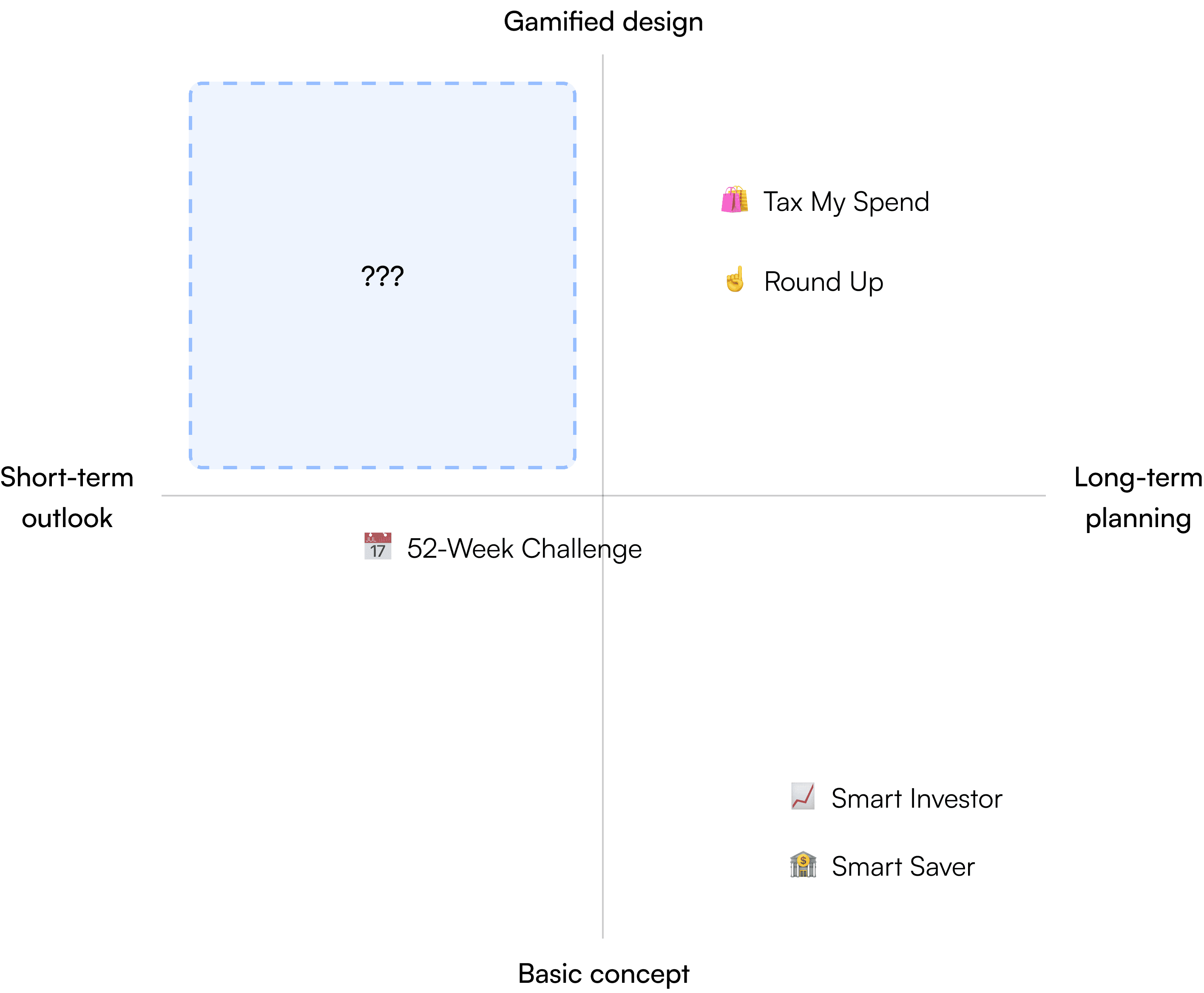
A few examples of current Auto Routines:
🏦 Smart Saver
Automatically saves a fixed amount of money into an account of choice on a recurring weekly, biweekly, or monthly basis
📅 52-Week Challenge
A program that automatically saves $1 the first week, $2 the next week, $3 the 3rd week, etc. into an account for 52 weeks
☝️ Round Up
Automatically save the spare change up to the next dollar amount and into a designated account each time a debit card is used
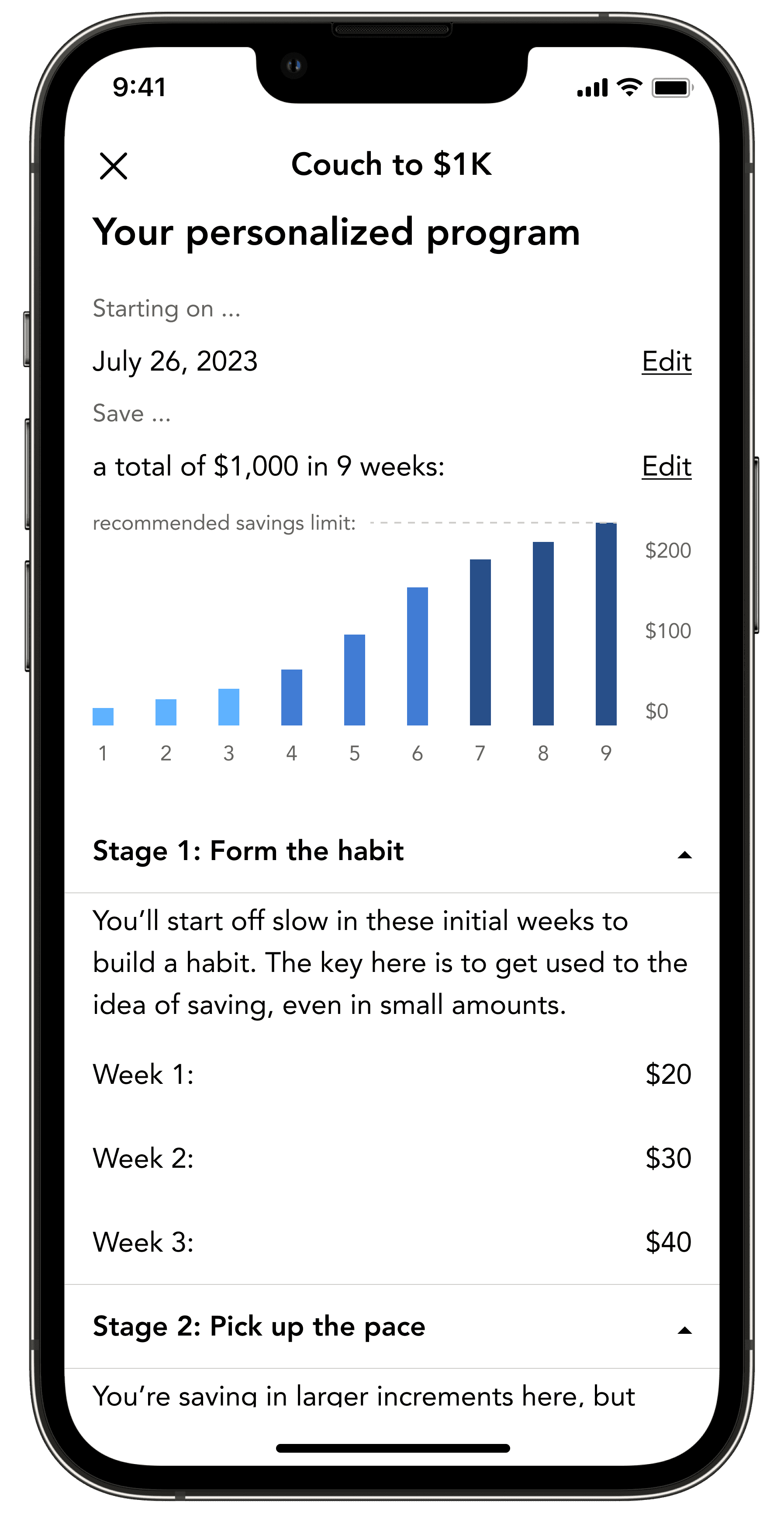
A new Auto Routines program prototype
Program design
A new Auto Routine inspired by the
“Couch-to-5K” running challenge
Helping users “off the couch” to save their first $1,000 by the end of the 9-week program
Behavioral economics from C25K used to keep users motivated throughout the program
Purposeful increase in savings designed to help build financial fitness


Set-up
An intuitive process to understand and adjust the program
Choose the program from a variety of others,
Learn the basic concept of the program,
Input the min. & max. amount to save based on the user’s comfort level,
And view a visualization of their personalized 9-week program to complete setting up.
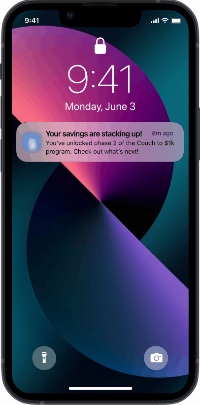
Re-engagement
Nudges, badges, and tips to keep motivation high
Nudges with positive messaging shown to increase Auto Routines’ user retention by 14%
Notifications given to users to keep them on track, celebrate progress, and offer advice
Different internal/external motivation messaging shown to users depending on the week #
Generally positive feedback in the usability test
“The program moves at a fast pace, and it’s definitely a lot... But I trust that it’s helping me push through it.”
– Usability tester #4
“I like how it’s teaching me what’s going on... It feels more involved, and it gets me more excited about my progress.”
– Usability tester #5
“This was really easy to set up and navigate. I LOVE the graph, that’s literally what I wanted to see to clarify my questions.”
– Usability tester #2
After reviewing past user interviews of various Auto Routines from different use cases, I found 3 main pain points with the current offerings:
📃 Fear of commitment
Users felt hesitant about committing to a routine indefinitely or for a year at a time. Instead, they wanted something that could give them gratification more instantaneously.
“These feel too intimidating to start and keep up.”
🧐 Arbitrary saving values
Users wanted something that challenges them and adapts as they get more experienced. However, current offerings usually have a fixed saving value or is arbitrary in nature.
“I want a program that evolves with me and my experience.”
🥱 Not interesting enough
Even with automated transactions, users didn’t feel motivated to set it up in the first place because the idea of “saving” didn’t entice them.
“These options just don’t get me excited about saving.”
No Auto Routine with a focus on short-term, gamified program design
Given the feedback, I assessed the opportunities for the value that a new product should bring in relation to the current offerings to help transition myself from the problem space to the solution space. Among others, I mainly focused on the complexity and the duration of the program design. Here’s a visual representation of my thought process on a 2x2 matrix:
Why would a “Couch-to-5K” savings program work?
While discussing potential program designs with my manager, we came across the topic of the “Couch-to-5K” running challenge. After brainstorming, we decided to build out this idea among others because we felt that it best fit the profile of our user and product needs, and the only real way to find this out was through user testing. Over the next few weeks, I designed a prototype to validate the hypotheses below, which also guided the ideation process:
The novelty of the popular running challenge turned into savings will engage users.
Being a popular challenge that gets beginners off the couch and ready for their first 5K in 9 weeks, we thought that the fun name and the popular concept will get users more excited about saving.
Aspects of the behavioral economics used in C25K can be translated into savings.
C25K is structured strategically to maximize efficiency and help runners retain motivation to finish the challenge. Understanding how this works and using it in the savings program can help savers as well.
The idea of “building financial fitness” will motivate users.
Changing the narrative from “saving for an event” to “saving to better myself / my financial fitness” will help users feel more motivated and involved in the experience.
Learning what makes the C25K program successful
To emulate the C25K running program into an Auto Routine, I first conducted research on the running program to understand what makes it successful. After reviewing many program designs and YouTube vlogs, I mapped out my findings in an affinity map.

With further understanding of the program, I used a user journey to map out the runner’s experience throughout the 9 weeks of completing the running program to highlight the opportunities at each “phase” of C25K:

Based on this research, I looked for insights & opportunities to consider when translating C25K from running to savings. Here is a summarized version:
Personalization & flexibility 🧬
Insight:
The running program allows users to run and walk at their own pace, which helps them feel less overwhelmed.
Opportunity:
Allow users to sandbox their own saving amounts and adjust to their comfort level
Purposeful rise in intensity 📈
Insight:
The first few weeks were extremely easy, then ramped up quickly, and finally plateaued in intensity at the end to maximize motivation.
Opportunity:
model the program with similar principles for users to feel well-adjusted
Changing motivation 🏋️♂️
Insight:
Users started due to external motivation such as losing weight, but internal motivation took over when they started making progress.
Opportunity:
Attract users by emphasizing the monetary benefits, then help them understand more about healthy financial habits afterwards.
Designing the optimal 9-week Auto Routine program through trial & error
After brainstorming ideas, I played around with the program details on Excel to create a feasible 9-week program. While we initially hoped for users to save their first $5,000 as the name suggests, we changed it to $1,000 instead, since it would take users months to complete. Instead, here’s what we came up with:

Prototyping the user flow to prepare for user testing
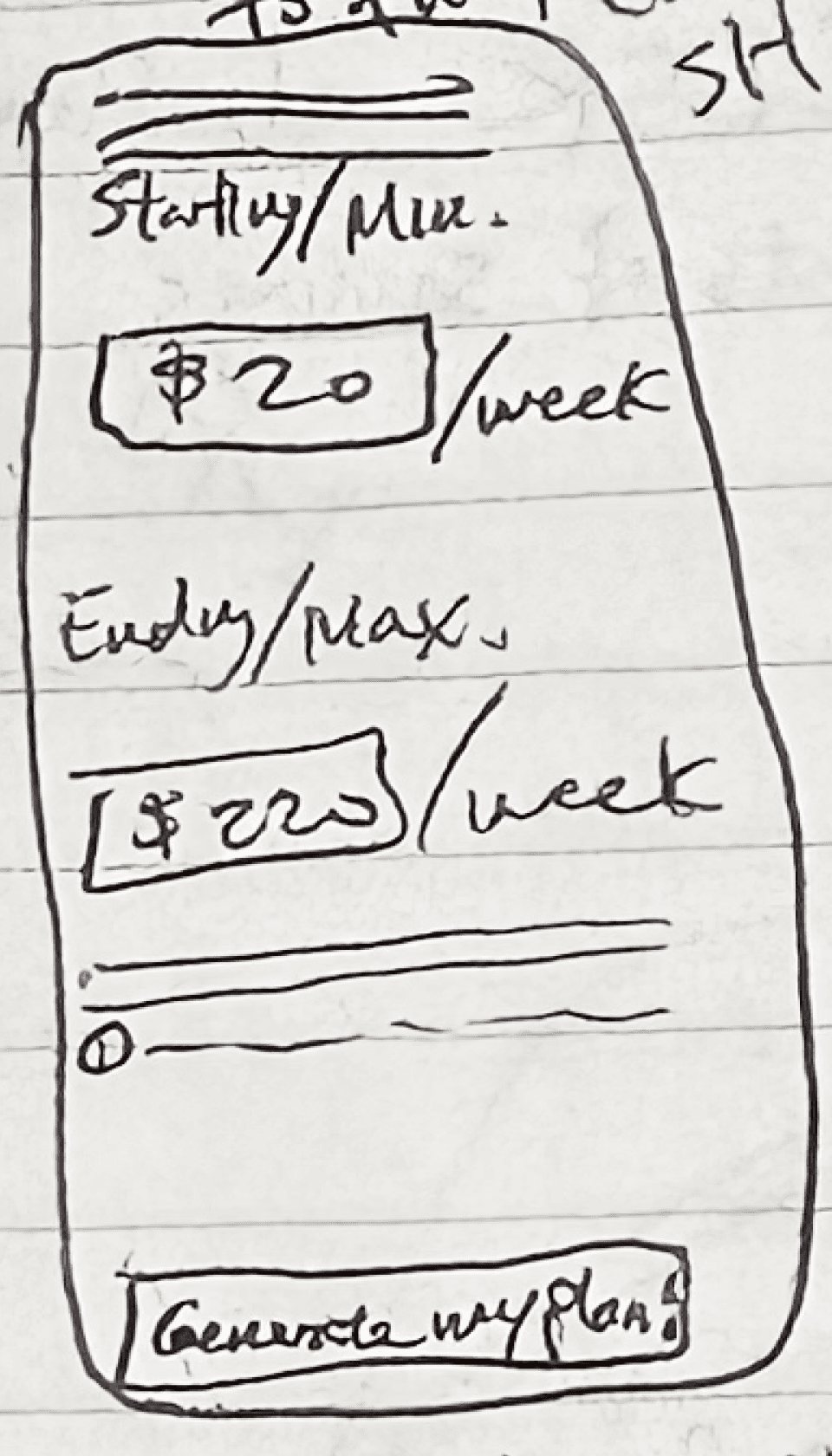
After I laid out the specifics of the Auto Routine, I worked on designing the user flow of its set-up process. To start, I brainstormed the general tasks that the user would accomplish in this flow:
Start 🏎️️
Select “Couch-to-$1K” from the variety of Auto Routines
Learn the basic concept of “C21K”
Customize by setting min. & max. $ amounts
View details of the personalized program
Confirm set-up
Finish 🏁
In addition, I also thought about re-engaging users into the program through nudges on a periodic basis to get updates on their progress:
Start 🏎️️
Receive notification from the app on an insight
View progress and expectations for the upcoming week
(Optional): change the program details
Finish 🏁
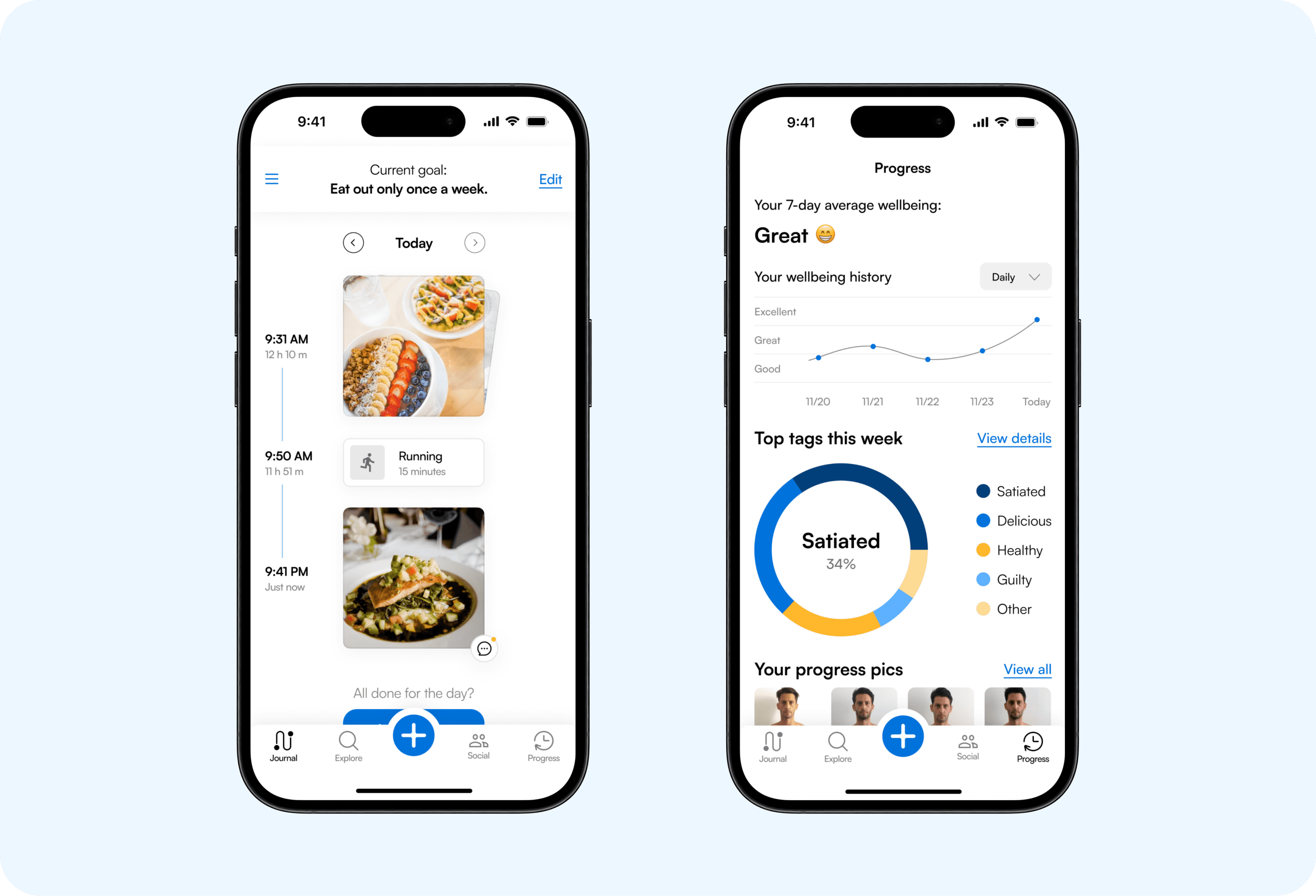
Because there was already an existing user flow for the set-up processes of other Auto Routines, I made sure to reuse components and screens wherever it was possible to maintain consistency across services. While I made small changes to all screens, there were specifically 2 new ones that I iterated and got feedback for user testing - the customization page 🧪 and the program detail page 📒. Here is my thought process for them:
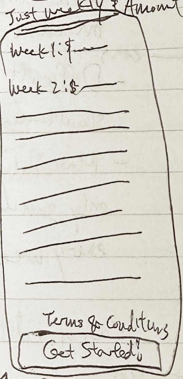
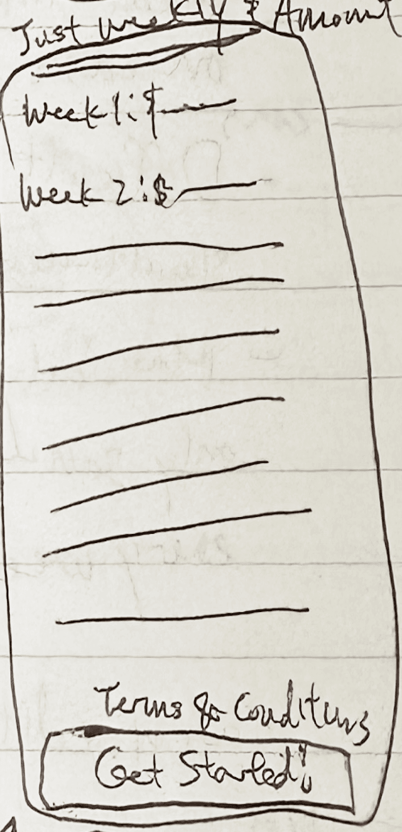
🧪 The sandboxing screen:


📒 The program detail screen:


Improvising by “indirectly” testing the concept of the program through a usability test
After finishing the prototype, I worked with a UX researcher to set up a formal democratized research plan with the goal of testing the concept resonance and usability of the program. However, because concept testing cannot be democratized, we decided to ask our participants questions about the concept of the program indirectly in our usability test, asking questions such as but not limited to:
When you see and read the phrase “Couch-to-5K,” what comes to mind?
What do you think about the routines you see? Which one might you choose/not choose and why?
How would you expect the Couch-to-$1K program to be structured? What value, if any, do you see in this program?

Overall, our initial hypotheses were validated.
After viewing the responses from the participants, I synthesized the results and derived these insights:
The novelty of saving through C21K resonates with some users.
3 out of 6 participants recognized the name and associated it with the running program. In addition, 4 out of 6 participants stated that they would consider choosing the program over others.
Users are willing to step out of their comfort zone (in some cases).
Many said that they felt slightly intimidated by the proposed saving amount on week 9. However, they also said that they are willing to step out of their comfort zone given the proper reason and guidance.
HMW... push users past their comfort zone to help them further their financial fitness?
Showing the “science” behind the program design increases motivation.
Participants found it helpful to understand why they were following this program, especially when saving amounts became steeper. Because of this, guiding users with visuals and descriptors on the program detail page was crucial to their motivation.
Participants valued personalization.
Many participants wanted to adjust the program even after they saw their results, suggesting that greater measures should be taken to personalize the program to meet their needs.
Improving the prototype with insights from the usability test
The usability test validated initial doubts that I had about translating the concept of running into savings effectively. However, it also raised lots of new opportunities for improvement. While my internship ended after I synthesized the test results, I recommended the suggestions below for my team to iterate further:
Designing a more effective, “pain-free” program
Given the participants’ reactions towards the end of the program, it may be worthwhile to test other program designs as well. One suggestion from the behavioral economics department was to utilize the “Peak-End Rule,” which might be more effective in minimizing the pain of saving for users.
Explaining the program details earlier in the flow
One pain point for participants was that they had little idea on what the program would look like until late into the flow. Providing this information in the beginning can help increase conversion.
Building out a responsive program model
My prototype only allowed the user to reach $1,000 with a fixed min. and max. amount. In the future, there should be a customizable, responsive model that helps users reach $1,000 with the same feel.
Helping users push their boundaries
While the idea of building financial fitness was communicated, not everyone seemed to understand it from the beginning. Emphasizing this idea can increase motivation for users to continue.
My thoughts on this experience
This was my first internship at a big company! With so many “firsts”, there were many things that exceeded my expectations, as well as things that didn’t go as expected. Either way, I’m grateful to learn from all of the experience. Since it’ll take too long to list everything out, here’s a quick summary of it:
Rose 🌹
Taking ownership from research to testing
Great experience to work through the entire design process on an enterprise level
Very fulfilling to see real users validating and critiquing my designs
Thorn 🌵
Logistics and expectations behind user testing
The process of setting up the usability test took much longer than expected
Opportunity to communicate and plan my project timeline more clearly in the future
Bud 🌱
Building out this project
Excited to see how this project will progress in the future
Thank you for reading! 😁


Let’s connect!
Bryce Lee / Product Designer
bryceleeux.framer.ai

